One Blackfriars. Inspired by glass genius, made possible by glass innovation.
London, United KingdomHow do you take an idea inspired by a beautiful glass vase and transform it into one of London’s most iconic new developments?
This was a question award-winning architects SimpsonHaugh, and developers St George, asked themselves many times when creating One Blackfriars – and asked of Guardian Glass.
The 170 metre tower at the heart of the South Bank development is based on the 1950’s ‘Lansetti II’ vase by renowned glass sculptor and designer Timo Sarpeneva. A design especially admired for its dynamic form that changes depending on the light.
It was a beautiful free-form sculptural shape that would only enhance London’s iconic skyline. The real challenge then was to stay true to this whilst accommodating 274 apartments in the 50 storey main tower, with a boutique hotel and retail and leisure space at the base.
To achieve this, the architects first created a ‘tower within a tower’ incorporating two distinct, independent façades. The inner façade or ‘skin’ would form the luxury residential block, meeting all the aesthetic and performance requirements that entails. Whilst the beautifully curved and rounded outer skin – made up of over 5,000 Guardian Glass panels – would form the overall shape of the building, with its elegant tapering lines echoing the original vase design.
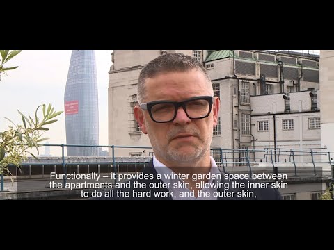
Christian Male, Partner at SimpsonHaugh adds “We always wanted a very clean look and for it to be as ‘white’ as possible, so low iron was important. We also wanted a duality of appearance; sometimes transparent to reveal the coloured glass panels of the inner skin and the individual apartments, and at other times to have a presence so the elegant form would be expressed.”
To solve this, Guardian Glass worked closely with both SimpsonHaugh and the glass processors during the design and planning stage, researching over 30 different glass types to find the perfect combination.
“The creation of the outer skin was challenging” says Richard Mayall, Regional Commercial Manager, Guardian Glass. “A third of all the outer glass panels needed to be curved, and some double curved. The curvature had to meet very precise measurements and the glass also had to deliver clean colour, minimal reflectance and high transparency.”
Christian Male adds “The combination of low-iron glass with the coating generates this very clean appearance, which at times is highly reflective. It is visually very rich, particularly when combined with the back-painted coloured glass panels behind.”
The large, prominent glazed areas of the storefronts at the base and the tower’s lobby also required a bespoke solution. Solar protection and thermal insulation were required, but also light transmission and transparency, despite the 5cm thick double-glazing. This was solved with a combination of coated solar control glass and highly transparent, neutral low-iron glass.
For the hotel exterior, which needed to look as close as possible to the tower, high performance coated solar control glass was used on both the flat and curved coated glass panels. SimpsonHaugh also made use of frit patterns and insulated shadow box panels to generate a feeling of depth and emulate the tower’s cladding.
Guardian Glass products used
- Tower: Guardian SunGuard® HD Silver 70 on Guardian UltraClear™ low-iron glass. Supplied as laminated monolithic glass, comprising two lites of 6mm coated glass laminated with both coatings against the PVB.
- Tower lobby and retail storefronts: Guardian SunGuard® SN 51/28 coated solar control glass on Guardian UltraClear™ low-iron glass.
- Hotel exterior: Guardian SunGuard HP Neutral 60/40 for the flat coated glass panels, and SunGuard HP Neutral 50/32 for the curved sections – both on Guardian UltraClear™ low-iron glass.
.jpg.transform/rendition-1280-keep/img.jpg)
.jpg.transform/rendition-1280-keep/img.jpg)
.jpg.transform/rendition-1280-keep/img.jpg)
.jpg.transform/rendition-1280-keep/img.jpg)


.jpg.transform/rendition-470-280/img.jpg)
